Introduction: Why I Redesigned My Site
Once in a while I get the idea to redesign my website. Latest iteration was a site that tried to capture the early 2000’s retro look. In the end, it wasn’t clean and certainly didn’t reflect what I actually wanted my online presence to say.
There is a fine line in doing retro look: small things can make it look like it is not intentionally retro, you just suck at design.
Eventually, I hit a wall. Time to start fresh. The technology stayed the same, though: I prefer Astro on projects like this, since it is fast to use and I am already familiar with it.
Why I Chose Bauhaus
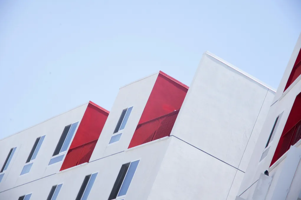
Bauhaus caught my attention while browsing inspiration sites. It’s structured, functional, colorful in a restrained way - everything my old site wasn’t. It can be minimal but at the same time beautiful and different.
Last thing I wanted was a developer portfolio that looks just like every other developer portfolio out there. I wanted something hand-made and personal.
I kept some charm from the old site, like the hamburger menu shaped like an actual hamburger - reinterpreted to fit the Bauhaus grid and palette. It’s playful, but in context.
Quality of Life Features
This redesign wasn’t just about the look. I added things that actually improve usability:
- Estimated read times for blog posts (calculated from word count)
- A “back to top” button to the right bottom corner for mobile and long-form content
- Semantic markup and keyboard navigation for better accessibility
- Cleaner blog index with visual rhythm and accent colors
- Added RSS feed for blog
How It Was Built
The rebuild was heavily assisted by GPT.
First, I worked with ChatGPT to establish brand guidelines - fonts, color palettes, layout principles, and copy tone. Then I pulled reference from classic Bauhaus posters and print material and other bauhaus inspired websites. I asked GPT for structured tasks: “Make the hamburger menu Bauhaus-style,” “Add a scroll-to-top button,” “Implement estimated read time.”
When we had bounced around ideas enough and task was ready, I fed the task into Codex that is hooked into my GitHub repository.
Task by task, it updated the codebase. I reviewed every change, fixed where it got stuck, and sometimes adjusted details by hand. It wasn’t fully “vibe coding,” but it was collaborative.
Key Takeaways
- Bauhaus can be a refreshing, practical style for developer portfolios
- Astro enables fast iteration with minimal overhead
- GPT tools are surprisingly helpful in UI and layout tasks - if used deliberately
- A portfolio should reflect personality, not just trends
What’s Next
I consider this version a strong baseline. It’s clean, responsive, and far more intentional than what I had before. But it’s not done.
Over time, I’ll add more personality - subtle animations, unique page layouts, maybe even a few easter eggs. The site should feel like mine, not just like a design system.
There’s still work to do, but at least now I’m proud to show it off.